Raymii.org

אֶשָּׂא עֵינַי אֶל־הֶהָרִים מֵאַיִן יָבֹא עֶזְרִֽי׃Home | About | All pages | Cluster Status | RSS Feed
Responsive QML Layout (with scrollbars)
Published: 05-10-2021 | Author: Remy van Elst | Text only version of this article
❗ This post is over five years old. It may no longer be up to date. Opinions may have changed.
Table of Contents
Screen recording of a responsive
GridLayoutin aScrollView
In this article I'll show you how to make a responsive layout in Qt / QML that automatically adjusts the amount of columns and rows based on the window dimensions, including scrollbars for when the content does not fit inside the window. This also works if you have a portrait and landscape orientation of your application, since the screen or window dimensions will be different across those two builds. I also explain how the dynamic resizing works with an explanation of property bindings in QML and as a bonus this works on mobile (Android/iOS) as well.
QML is a markup language (part of the QT framework) like HTML/CSS, with inline
JavaScript that can interact with the C++ code of your(QT) application. QML
has the concept of Layouts to arrange items in a user interface. You
can have a RowLayout for, unsurprisingly, a row of items, or a
ColumnLayout for a column of items. GridLayout is the most flexible, that
allows for a grid of items. There is also the StackLayout, where only one
item is visible at a time. You must specify te amount of rows and columns, but that
does not change when a user resizes the window. This means that the layout
is not responsive.
A responsive layout means that when the window dimension (or device rotation aspect) changes, the contents of said window automatically reposition themselves in a way that fits best. Like how modern websites look great on your desktop and phone, using a different layout for each device. In Qt / Qml this is possible, but not by default.
Here are two pictures that show off a RowLayout and a ColumnLayout to
help you visualize the concept:
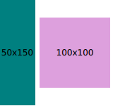
RowLayout with 2 rectangles

ColumnLayout with 3 rectangles
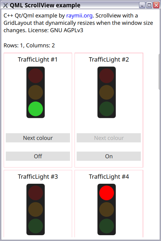
We'll be re-using my Traffic Light QML, that I used in my earlier article
describing the different ways of exposing C++ classes to Qml. The Traffic
Light control is in the GridLayout, within a Repeater, 16 instances.
(The example works just as well with 500 instances). Each traffic light has a
border around it to help visualize the flow and positioning and there is a
row and column counter at the top. As a fun bonus I added a Timer {} with a
random interval between 2 and 15 seconds per traffic light to cycle the
different lamps. Here is how it looks, but you've already seen that in a
recording at the top of this page.
All the source code for this example project can be found on my github here.
I'm using Qt 5.15 so you can match that up if you tag along with the guide.
I've also compiled this demo to WebAssembly here.
Responsive GridLayout
Automatically resizing the GridLayout based on the window size is done by
specifying a bit of JavaScript code in the columns: and rows: properties
of your GridLayout:
readonly property int elementWidth: 150

    columns: Math.max(Math.floor(parent.width / elementWidth), 1)
    rows: Math.max(Math.ceil(children.length / columns), 1)
Here is how it looks inside an entire GridLayout contol:
    GridLayout{
        id: exampleLayout
        readonly property int elementWidth: 150

        columns: Math.max(Math.floor(parent.width / elementWidth), 1)
        rows: Math.max(Math.ceil(children.length / columns), 1)

        anchors.fill: parent
        rowSpacing: 5
        columnSpacing: rowSpacing

        Repeater{
            id: model
            model: 16
            Rectangle {
                width: exampleLayout.elementWidth
                height: 250
                border.color: "pink"
                Layout.alignment : Qt.AlignLeft | Qt.AlignTop
            }
        }
    }
I've defined a property elementWidth to make sure the formula is correct. It calculates
how many columns there should be based on the width of the parent (which is the width of the
GridLayout due to anchors.fill: parent) and the width of each element.
The amount of rows is calculated based on the amount of columns and how many children there
are. I'm using the implicit property children.length for that, so even if you dynamically
place new items in the layout, it will still resize properly.
The Math.max safeguard is required so we have at least one row and one column at all times.
I had crashes when I omitted it:
terminate called after throwing an instance of 'std::bad_alloc'
  what():  std::bad_alloc
Due to property bindings and implicit change signals the values in rows and columns are
automatically updated on each window resize. In the next paragraph I'll go in to more detail
how that all works.
You don't explicitly need to set the amount of rows: but because I want to show that
number in a Text{} I did set explicitly. Otherwise it would be -1.
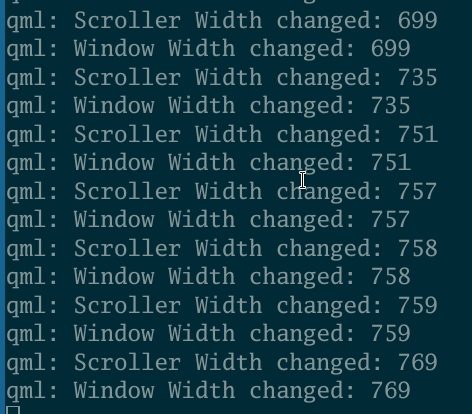
Implicit change signals for every QML property
How does this work? How does the GridLayout knows when the window is
resized? QML has built-in property change signals (for each property) that are emitted whenever a
property value changes. Since width and height are properties of a control,
when they change, a signal is emitted, widthChanged, which you can hook up
to an onWidthChanged: signal handler. The ins and outs are documented here
and you can see it in action for yourself by adding a signal handler to your root Window control
and to your GridLayout or ScrollView control:
onWidthChanged: { console.log("Window Width changed: " + width) }
onHeightChanged: { console.log("Window Height changed: " + height)}
Here's how that looks in the example application when the window is resized:
The GridLayout or ScrollView width and height are coupled to their parents (thus the Window)
in our example. When those parent properties change, their own properties change as well, including
each other property that uses such a value. The mechanics of property binding are documented here,
I'm quoting the relevant part below:
When a property's dependencies change in value, the property is
automatically updated according to the specified relationship.

Behind the scenes, the QML engine monitors the property's dependencies
(that is, the variables in the binding expression). When a change is
detected, the QML engine re-evaluates the binding expression and applies
the new result to the property.
Property binding and re-evaluation is extremely useful but if you have a property that is used all over the place, stuff can get messy quickly.
Scrolling, scrollbars and a ScrollView
In the introduction I also promised to show you how to add scrollbars. If we
have too much content to fit in the window, even when the GridLayout
automatically resizes, scrollbars are required for the user to navigate. A
Qml Window does not automatically have scrollbars, you have to add them by
specifying an explicit ScrollView and adding your items inside of that.
You can have a scrollbar for your entire Window but you can also add a
ScrollView for certain elements only. Like a text field or an image viewer,
if something doesn't fit inside the dimensions of the element, the user can
scroll to still see everything.
This is an example of a ScrollView, in my example code that houses the GridLayout:
ScrollView {
    id: scroller
    anchors.top: parent.top
    anchors.left: parent.left
    anchors.leftMargin: 5
    anchors.topMargin: 5
    width: parent.width
    height: parent.height * 0.8
    clip : true

    GridLayout{
        ...
    }
}
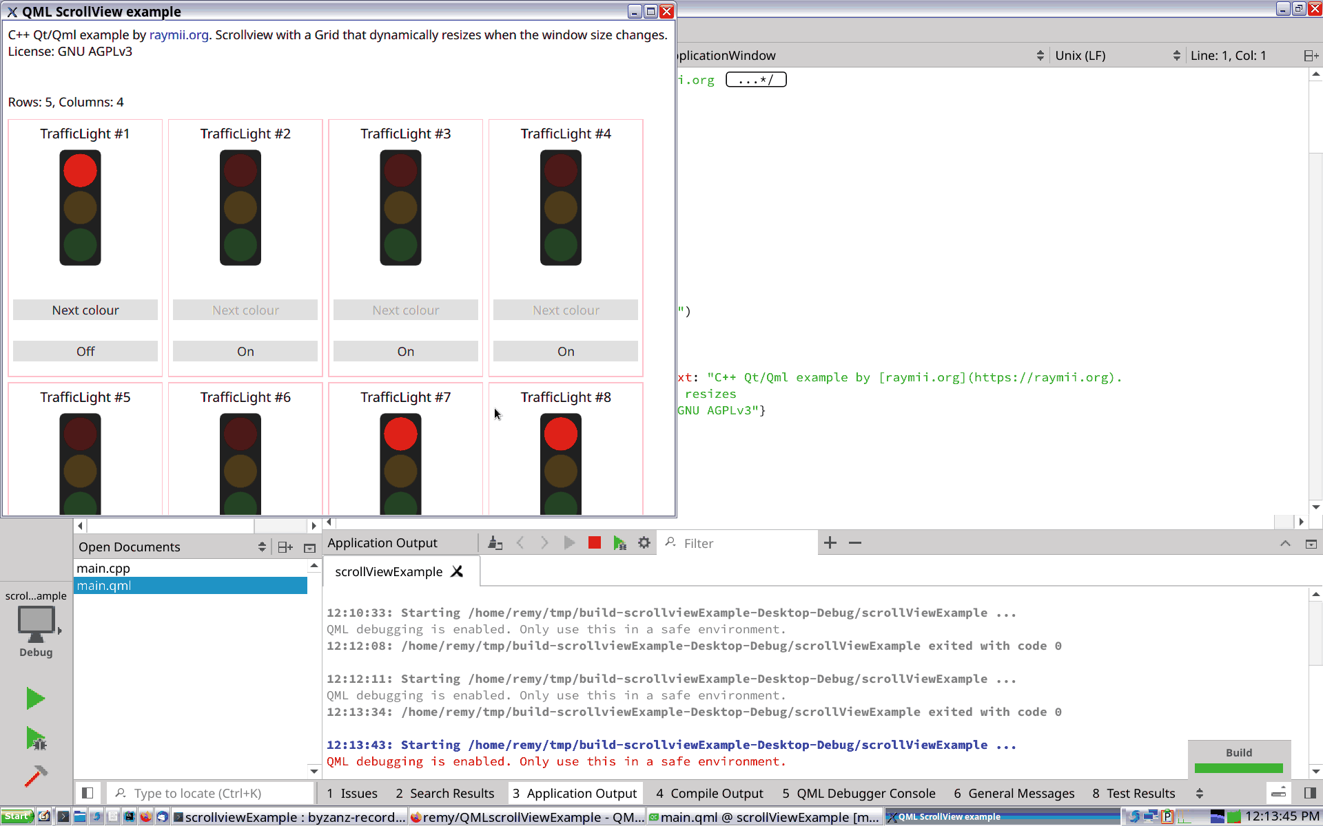
Here is a screenshot of the example application with a GridLayout without the
rows: or columns: property set. It results in 1 row, unlimited columns:
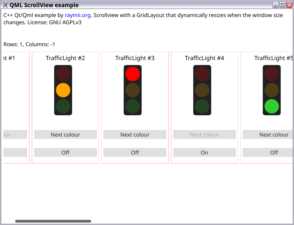
In the screenshot you see a horizontal scrollbar at the bottom. If that would not be there, only the controls on screen would be visible and usable by the user. If they have a small screen, they might not be able to use all items inside the layout.
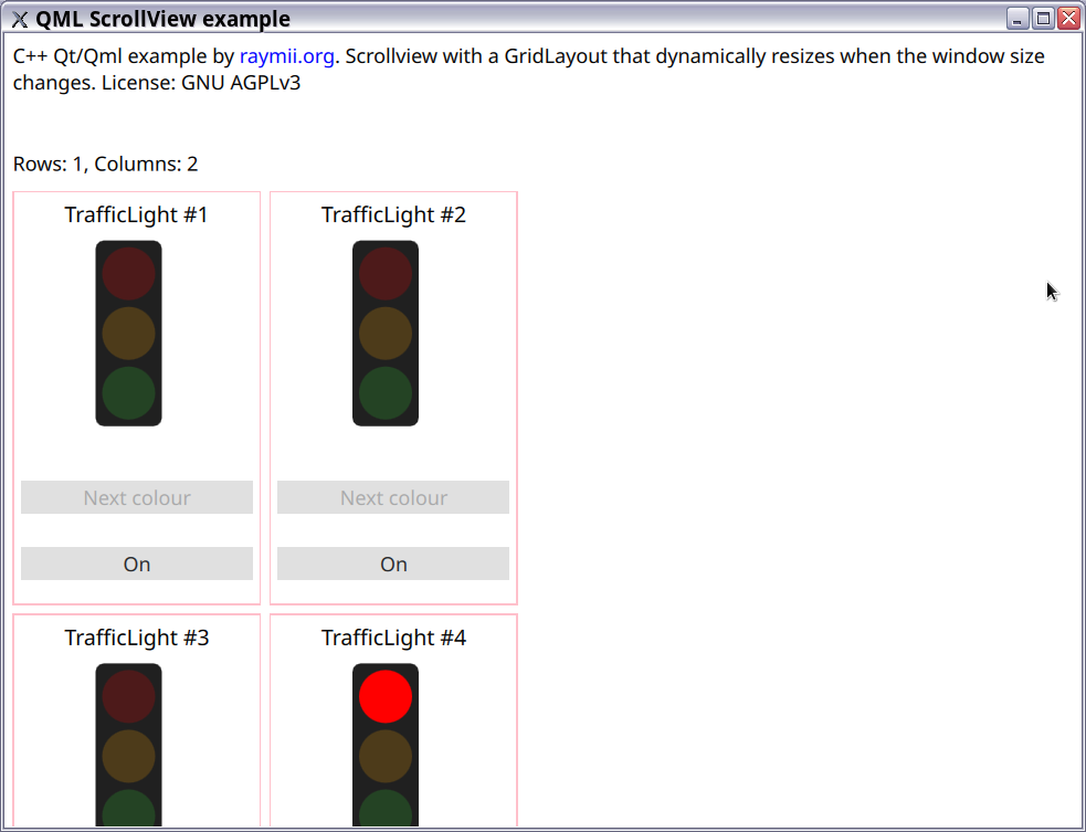
If an amount of columns: is specified, there will be no more than that
amount of columns, but unlimited rows. Here's how a property of columns: 2
looks:
With a ScrollView you don't have to specify if you want a horizontal and/or
vertical scrollbar, based on the contents and dimensions of the ScrollView
the QML engine decides which one (or both) is required.
Depending on the window manager theme and preferences the user has
set, the scrollbars will be hidden by default until they mouse over them.
Doesn't help usability wise, but there are two properties you can set in the
ScrollView to control the visibility:
    ScrollBar.horizontal.policy: ScrollBar.AlwaysOn
    ScrollBar.vertical.policy: ScrollBar.AlwaysOn
More information on those two properties and how they work when used with touch gestures instead of a mouse can be found here.
Does this work on Mobile?
I've compiled this project for Android and tested it, when rotating the phone the amount of rows and columns changes and the scrolling works as you would expect.
Nothing special had to be done except for installing the correct Android SDK and tools, which all can be done from Qt Creator. Plugged in one of my older Android phones and like magic, the application popped up. Below are screenshots and a screen recording.
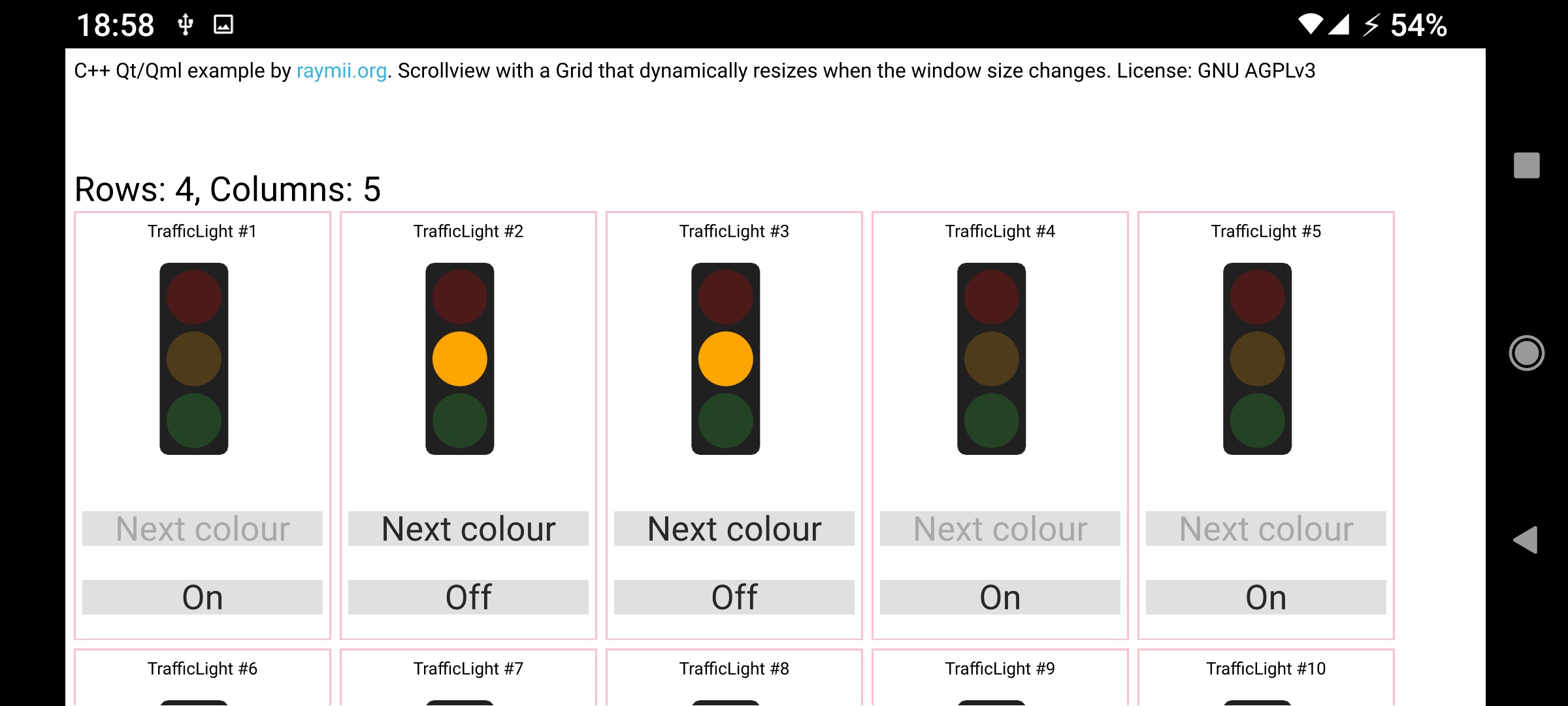
This is a screenshot in Landscape mode
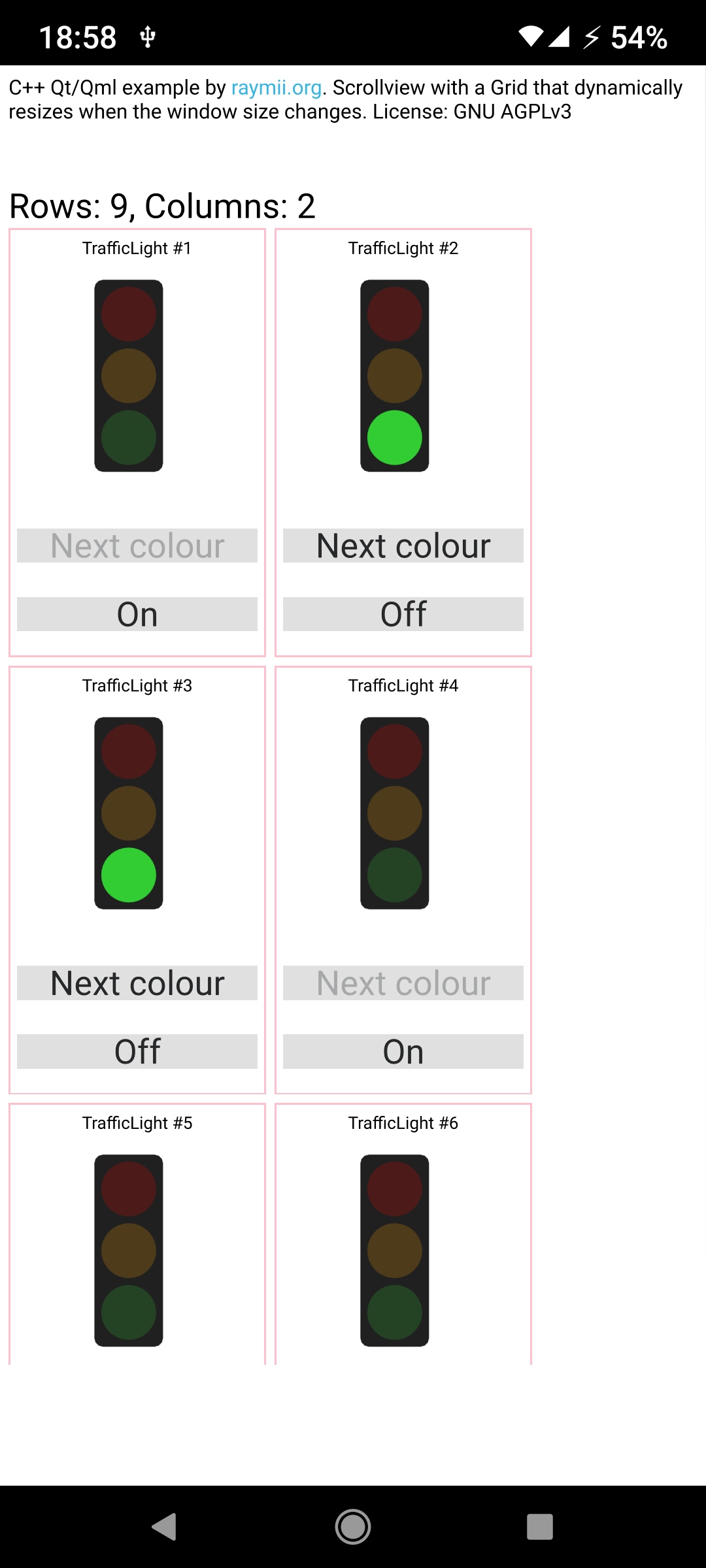
This is a screenshot in Portrait mode
Notice how the amount of columns and rows changes per aspect?
Here is a video screen recording showing how the application runs on the phone.
WebAssembly demo
For fun I compiled the example application to webassembly. Run it here
or, if it loads, an iframe below: