Raymii.org

אֶשָּׂא עֵינַי אֶל־הֶהָרִים מֵאַיִן יָבֹא עֶזְרִֽי׃Home | About | All pages | Cluster Status | RSS Feed
GNUplot tips for nice looking charts from a CSV file
Published: 06-07-2019 | Author: Remy van Elst | Text only version of this article
❗ This post is over six years old. It may no longer be up to date. Opinions may have changed.
Table of Contents
- The basics, parsing a CSV file
- Using the first column as x axis date time
- Using the first CSV column as title
- Using a second Y axis
- Using multiple environment variables in gnuplot
- Styling (grid, line type, colour, thickness)
- Rotating axis labels and placement of the legend
- Creating an A4 PDF output file
- The CSV file
Recently I had to do some testing which resulted in a lot of log data. Looking at a bunch of text is not the same as seeing things graphically, this particular logdata was perfect to put in a graph. My goto favorite tool for graphs and charts is gnuplot. Not only is it very extensible, it is also reproducable. Give me a configfile and command over "do this, then this and then such and such" in Excel to get a consistent result. In this article I'll give tips for using gnuplot, which include:
- Parsing a CSV file
- Parsing the first column as a date/time
- Using the first CSV column as title
- Using a second Y axis
- Using multiple environment variables in gnuplot
- Styling (grid, line type, colour, thickness)
- Rotating axis labels
- Creating an A4 PDF output file
I've got an article published here where you can read howto make a bar-chart (histogram) with gnuplot. The data in this article is masked, but that doesn't matter for the gnuplot results.
I'm using gnuplot 5.2 on Ubuntu 18.04, installed via the repository. You can
find my example CSV data at the bottom of this article. Save it as plot.csv.
The article will go over the different topics step by step. The data is from
another piece of software I've written and contains extra information, but that
is prefixed with a hash (#). Not valid CSV, but we'll use that inside gnuplot
to append some data to the title of the graph.
Here is a picture of the finished result we're working towards:
The basics, parsing a CSV file
Let's start with the basic setup and command. Create a file named
example.gnuplot in the same folder as your csv file and put the following in
there:
set datafile separator ','
plot plot.csv using 1:2 with lines, '' using 1:3 with lines
The first line tells gnuplot to use a comma instead of whitespace to seperate the data (thus parsing the csv).
Run gnuplot, with -p to make the window persist:
gnuplot -p example.gnuplot
Result:
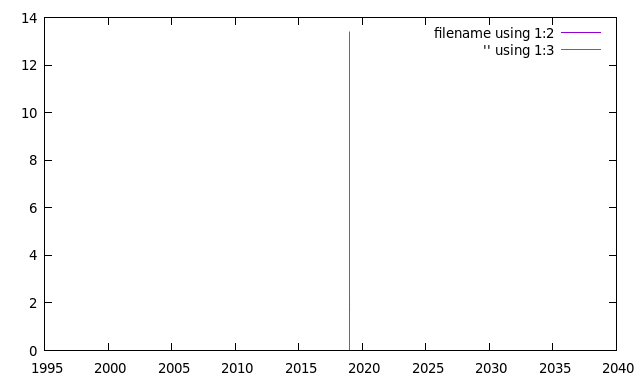
Okay, not much of what we want here. But, if you do see something like this picture, you know your setup is correct. Let's continue on.
Using the first column as x axis date time
The first column of our CSV file contains the date and time in an ISO8601 format. Let's tell gnuplot to use the first column as x axis datetime and specify the correct format. Update your gnuplot file:
set datafile separator ','

set xdata time # tells gnuplot the x axis is time data
set timefmt "%Y-%m-%dT%H:%M:%S" # specify our time string format
set format x "%H:%M:%S" # otherwise it will show only MM:SS
plot plot.csv using 1:2 with lines, '' using 1:3 with lines
Command:
gnuplot -p example.gnuplot
Result:
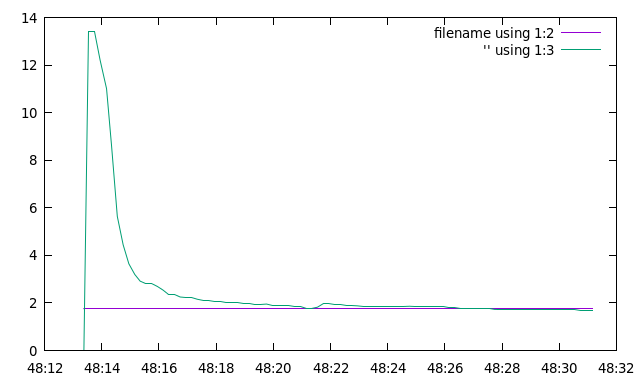
That looks more like it. The basics are there, our two lines on the Y axis and the datetime on the X axis. But the graph is still a bit hard to read. The legend has the plot commands, there is no grid and we're missing our second Y axis. Continue on.
Using the first CSV column as title
The CSV file has column headers in the first line:
"datetime","targetValue","measuredValue","secondYAxisValue",
Let's tell gnuplot to use those. We'll also add a label to the X and Y axis:
set datafile separator ','
set xdata time
set timefmt "%Y-%m-%dT%H:%M:%S"

set key autotitle columnhead # use the first line as title
set ylabel "First Y Units" # label for the Y axis
set xlabel 'Time' # label for the X axis

plot plot.csv using 1:2 with lines, '' using 1:3 with lines
Command:
gnuplot -p example.gnuplot
Result:
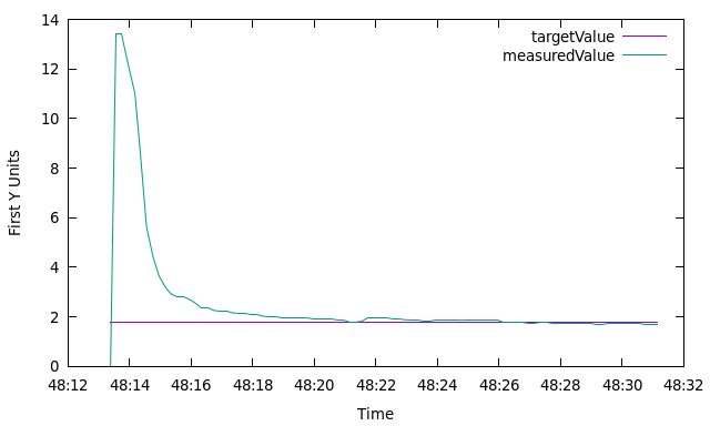
The legend is correct, and we have axis labels. Time to work on that second Y axis.
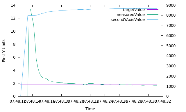
Using a second Y axis
The last column in our CSV file is a different unit but influences the other two. We want to show that on a second axis.
set datafile separator ','
set xdata time
set timefmt "%Y-%m-%dT%H:%M:%S"
set key autotitle columnhead
set ylabel "First Y Units"
set xlabel 'Time'

set y2tics # enable second axis
set ytics nomirror # dont show the tics on that side
set y2label "Second Y Axis Value" # label for second axis

plot plot.csv using 1:2 with lines, '' using 1:3 with lines, '' using 1:4 with lines axis x1y2 # new plot command
Command:
gnuplot -p example.gnuplot
Result:
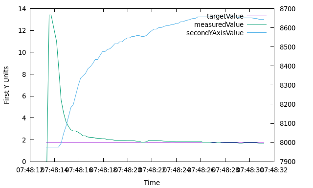
Second Y axis starting from 0?
As you can see, the second Y axis doesn't start from zero. That scale is
relative to the lowest value in your CSV. If you do want it starting from zero,
use the set y2range option:
set y2range [0:]
The first number (the zero) is the starting range. The second number is the end
range. I'm leaving the end range blank. Same goes for yrange or xrange.
With the axis starting from zero, the graph looks like this:
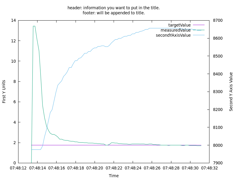
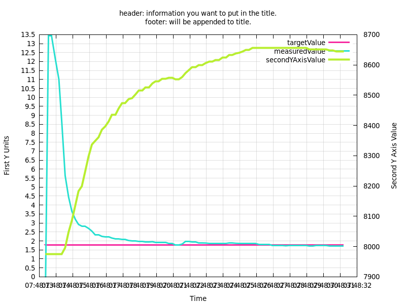
Using multiple environment variables in gnuplot
My situation is that I get about a hundred of these logfiles a day, times 25 machines. I'm not going to do all of the work by hand, so by using a few scripts we can programmatically generate these graphs.
Also, in the CSV file we've embedded two lines, header and footer, which
contain information I want in the graph title. With the -e option you can pass
(environment) variables to gnuplot:
gnuplot -p -e "titel='${PLOTTITLE}'; filename='${FILE}';" example.gnuplot
Do note that the environment variables are surrounded by single quotes. This is required for textual values. Also note the semicolon to seperate multiple values.
Inside gnuplot these are accessible:
set title titel #our var "titel" = ${PLOTTITLE}
plot filename using 1:2 with lines, '' using 1:3 with lines, '' using 1:4 with lines axis x1y2 #our var "filename" = ${FILE}
My complete command (to set the filename and title) includes a bit of parsing to
get the header and footer inside the title variable:
FILE="plot.csv";
PLOTTITLE=$(grep -i -e header -e footer $(echo $FILE) | sed s/\"\//g | sed s/\#//g);
gnuplot -e "titel='${PLOTTITLE}'; filename='${FILE}';" example.gnuplot
The graph with the dynamic title:
Styling (grid, line type, colour, thickness)
The graph up to this point contains all the data we want in it. The rest of these tips will focus on styling and presentation.
I'm going to talk about the linetype option for a bit first. In older gnuplot
versions, each terminal type provided a set of distinct linetypes that could
differ in color, in thickness, in dot/dash pattern, or in some combination of
color and dot/dash. These colors and patterns were not guaranteed to be
consistent across different terminal types although most used the color sequence
red/green/blue/magenta/cyan/yellow.By default gnuplot version 5 uses a
terminal-independent sequence of 8 colors. A terminal type can be the program
itself, a png file, a postscript file, etc.
Grid
We'll start off with the grid. I'm defining a new linestyle with a grey colour
and a smaller line. We're combining that with a smaller x/ytics size to get a
smaller grid.
set datafile separator ','
set xdata time
set timefmt "%Y-%m-%dT%H:%M:%S"
set key autotitle columnhead
set ylabel "First Y Units"
set xlabel 'Time'
set y2tics
set ytics nomirror
set y2label "Second Y Axis Value"

set style line 100 lt 1 lc rgb "grey" lw 0.5 # linestyle for the grid
set grid ls 100 # enable grid with specific linestyle
set ytics 0.5 # smaller ytics
set xtics 1   # smaller xtics

plot filename using 1:2 with lines, '' using 1:3 with lines, '' using 1:4 with lines axis x1y2
Gnuplot command:
FILE="plot.csv";
PLOTTITLE=$(grep -i -e header -e footer $(echo $FILE) | sed s/\"\//g | sed s/\#//g);
gnuplot -e "titel='${PLOTTITLE}'; filename='${FILE}';" example.gnuplot
Example output:
Line colour and thickness
The default colours are a tad bit uneasy to distinguish from one another. We can
turn them into a colour of our choosing by specifying the line style. I'm also
going to make the lines a bit thicker with the lw (line width) command.
set datafile separator ','
set xdata time
set timefmt "%Y-%m-%dT%H:%M:%S"
set key autotitle columnhead
set ylabel "First Y Units"
set xlabel 'Time'
set y2tics
set ytics nomirror
set y2label "Second Y Axis Value"
set style line 100 lt 1 lc rgb "grey" lw 0.5
set grid ls 100
set ytics 0.5
set xtics 1

set style line 101 lw 3 lt rgb "#f62aa0" # style for targetValue (1) (pink)
set style line 102 lw 3 lt rgb "#26dfd0" # style for measuredValue (2) (light blue)
set style line 103 lw 4 lt rgb "#b8ee30" # style for secondYAxisValue (3) (limegreen)

plot filename using 1:2 with lines ls 101, '' using 1:3 with lines ls 102, '' using 1:4 with lines axis x1y2 ls 103 # new plotcommand
Gnuplot command:
FILE="plot.csv";
PLOTTITLE=$(grep -i -e header -e footer $(echo $FILE) | sed s/\"\//g | sed s/\#//g);
gnuplot -e "titel='${PLOTTITLE}'; filename='${FILE}';" example.gnuplot
Example output:
The thicker lines combined with the narrow grid make it more easy to see where the two lines overlap or are near one another.
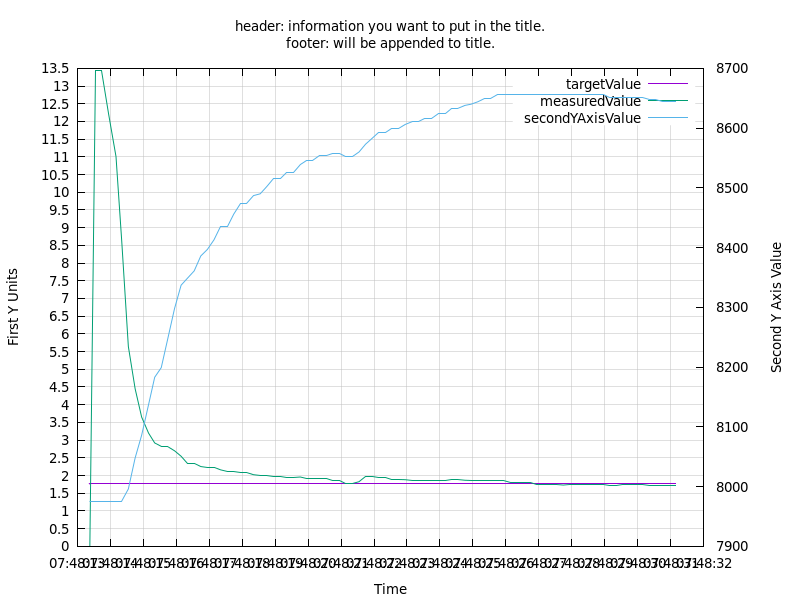
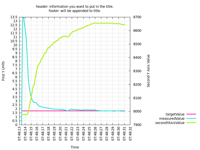
Rotating axis labels and placement of the legend
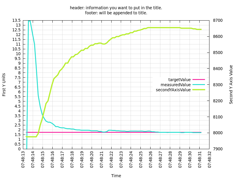
We're now nearing our final beautiful graph. A few things left to change. The legend is in the way of the upper second axis and the X axis values are overlapping eachother. Do note that the legend can be placed outside the graph, but that will lower the effective width of your graph. I wasn't able to figure out how to place the legend outside of the graph at the bottom, where it wouldn't cost horizontal screen space.
set datafile separator ','
set xdata time
set timefmt "%Y-%m-%dT%H:%M:%S"
set key autotitle columnhead
set ylabel "First Y Units"
set xlabel 'Time'
set y2tics
set ytics nomirror
set y2label "Second Y Axis Value"
set style line 100 lt 1 lc rgb "grey" lw 0.5
set grid ls 100
set ytics 0.5
set xtics 1
set style line 101 lw 3 lt rgb "#f62aa0"
set style line 102 lw 3 lt rgb "#26dfd0"
set style line 103 lw 4 lt rgb "#b8ee30"

set xtics rotate # rotate labels on the x axis
set key right center # legend placement

plot filename using 1:2 with lines ls 101, '' using 1:3 with lines ls 102, '' using 1:4 with lines axis x1y2 ls 103
Gnuplot command:
FILE="plot.csv";
PLOTTITLE=$(grep -i -e header -e footer $(echo $FILE) | sed s/\"\//g | sed s/\#//g);
gnuplot -e "titel='${PLOTTITLE}'; filename='${FILE}';" example.gnuplot
Example output:

Here is output with the set key outside right bottom option, so you can see
what I mean with the screen realestate:
This is the graph we want. If you want to have this output to a PNG file automatically, add the following options:
set terminal pngcairo size 800,600 enhanced font 'Segoe UI,10'
set output 'example.png'
If you want to have a gnuplot window with a different size and font:
set terminal wxt size 800,600 enhanced font 'Segoe UI,10' persist
The graph is finished and styled the way we want. I need to have these archived, with the other scripts I wrote the output files all go into a folder, but I needed PDF's for archiving and printing. We'll use an external tool for that.
Creating an A4 PDF output file
First install the ghostscript package:
sudo apt-get install ghostscript
This contains the tool we want (ps2pdf). gnuplot can output to .ps
(postscript), which we can convert to PDF and automagically get the correct page
format.
Add the following option to get the postscript output:
set terminal postscript enhanced color landscape 'Arial' 12
set output 'example.ps'
set size ratio 0.71 # for the A4 ratio
The gnuplot command:
FILE="plot.csv";
PLOTTITLE=$(grep -i -e header -e footer $(echo $FILE) | sed s/\"\//g | sed s/\#//g);
gnuplot -e "titel='${PLOTTITLE}'; filename='${FILE}';" example.gnuplot;
After that, use this command to convert the postscript file to a PDF:
ps2pdf -sPAGESIZE=a4 example.ps example_a4_$FILE.pdf;
If you want black and white instead of colour, omit the color enhanced part
from the set terminal line.
This should give you a PDF file which you can print directly. Below is the CSV file I used.
The CSV file
"datetime","targetValue","measuredValue","secondYAxisValue",
#header: information you want to put in the title.
"2019-07-04T07:48:13.377Z","1.76087","0.01","7975"
"2019-07-04T07:48:13.545Z","1.76087","13.431","7975"
"2019-07-04T07:48:13.744Z","1.76087","13.431","7975"
"2019-07-04T07:48:13.945Z","1.76087","12.21","7975"
"2019-07-04T07:48:14.170Z","1.76087","11.009","7975"
"2019-07-04T07:48:14.344Z","1.76087","8.61","7975"
"2019-07-04T07:48:14.545Z","1.76087","5.643","7996"
"2019-07-04T07:48:14.751Z","1.76087","4.447","8048"
"2019-07-04T07:48:14.949Z","1.76087","3.649","8086"
"2019-07-04T07:48:15.158Z","1.76087","3.198","8137"
"2019-07-04T07:48:15.345Z","1.76087","2.919","8183"
"2019-07-04T07:48:15.543Z","1.76087","2.821","8199"
"2019-07-04T07:48:15.744Z","1.76087","2.821","8248"
"2019-07-04T07:48:15.947Z","1.76087","2.697","8298"
"2019-07-04T07:48:16.145Z","1.76087","2.543","8337"
"2019-07-04T07:48:16.343Z","1.76087","2.348","8349"
"2019-07-04T07:48:16.544Z","1.76087","2.348","8361"
"2019-07-04T07:48:16.744Z","1.76087","2.253","8386"
"2019-07-04T07:48:16.945Z","1.76087","2.216","8397"
"2019-07-04T07:48:17.144Z","1.76087","2.216","8413"
"2019-07-04T07:48:17.344Z","1.76087","2.159","8435"
"2019-07-04T07:48:17.544Z","1.76087","2.125","8435"
"2019-07-04T07:48:17.744Z","1.76087","2.125","8456"
"2019-07-04T07:48:17.948Z","1.76087","2.079","8474"
"2019-07-04T07:48:18.145Z","1.76087","2.079","8474"
"2019-07-04T07:48:18.343Z","1.76087","2.022","8487"
"2019-07-04T07:48:18.546Z","1.76087","2.004","8490"
"2019-07-04T07:48:18.744Z","1.76087","2.004","8502"
"2019-07-04T07:48:18.945Z","1.76087","1.981","8515"
"2019-07-04T07:48:19.169Z","1.76087","1.981","8515"
"2019-07-04T07:48:19.345Z","1.76087","1.952","8526"
"2019-07-04T07:48:19.544Z","1.76087","1.952","8526"
"2019-07-04T07:48:19.765Z","1.76087","1.957","8539"
"2019-07-04T07:48:19.963Z","1.76087","1.913","8546"
"2019-07-04T07:48:20.149Z","1.76087","1.913","8546"
"2019-07-04T07:48:20.343Z","1.76087","1.902","8554"
"2019-07-04T07:48:20.545Z","1.76087","1.902","8554"
"2019-07-04T07:48:20.744Z","1.76087","1.855","8558"
"2019-07-04T07:48:20.943Z","1.76087","1.855","8558"
"2019-07-04T07:48:21.146Z","1.76087","1.762","8553"
"2019-07-04T07:48:21.344Z","1.76087","1.762","8553"
"2019-07-04T07:48:21.545Z","1.76087","1.824","8560"
"2019-07-04T07:48:21.743Z","1.76087","1.981","8573"
"2019-07-04T07:48:21.946Z","1.76087","1.981","8583"
"2019-07-04T07:48:22.147Z","1.76087","1.946","8593"
"2019-07-04T07:48:22.344Z","1.76087","1.946","8593"
"2019-07-04T07:48:22.545Z","1.76087","1.897","8599"
"2019-07-04T07:48:22.744Z","1.76087","1.897","8599"
"2019-07-04T07:48:22.944Z","1.76087","1.881","8606"
"2019-07-04T07:48:23.157Z","1.76087","1.86","8611"
"2019-07-04T07:48:23.345Z","1.76087","1.86","8611"
"2019-07-04T07:48:23.545Z","1.76087","1.845","8616"
"2019-07-04T07:48:23.745Z","1.76087","1.845","8616"
"2019-07-04T07:48:23.945Z","1.76087","1.865","8624"
"2019-07-04T07:48:24.163Z","1.76087","1.865","8624"
"2019-07-04T07:48:24.344Z","1.76087","1.875","8632"
"2019-07-04T07:48:24.546Z","1.76087","1.875","8632"
"2019-07-04T07:48:24.761Z","1.76087","1.865","8638"
"2019-07-04T07:48:24.947Z","1.76087","1.86","8640"
"2019-07-04T07:48:25.148Z","1.76087","1.86","8644"
"2019-07-04T07:48:25.344Z","1.76087","1.85","8649"
"2019-07-04T07:48:25.545Z","1.76087","1.85","8649"
"2019-07-04T07:48:25.744Z","1.76087","1.86","8656"
"2019-07-04T07:48:25.943Z","1.76087","1.86","8656"
"2019-07-04T07:48:26.143Z","1.76087","1.8","8656"
"2019-07-04T07:48:26.347Z","1.76087","1.8","8656"
"2019-07-04T07:48:26.545Z","1.76087","1.79","8656"
"2019-07-04T07:48:26.748Z","1.76087","1.79","8656"
"2019-07-04T07:48:26.943Z","1.76087","1.753","8656"
"2019-07-04T07:48:27.144Z","1.76087","1.753","8656"
"2019-07-04T07:48:27.348Z","1.76087","1.758","8656"
"2019-07-04T07:48:27.546Z","1.76087","1.758","8656"
"2019-07-04T07:48:27.746Z","1.76087","1.73","8656"
"2019-07-04T07:48:27.943Z","1.76087","1.739","8656"
"2019-07-04T07:48:28.155Z","1.76087","1.739","8656"
"2019-07-04T07:48:28.346Z","1.76087","1.744","8656"
"2019-07-04T07:48:28.545Z","1.76087","1.744","8656"
"2019-07-04T07:48:28.747Z","1.76087","1.739","8656"
"2019-07-04T07:48:28.956Z","1.76087","1.739","8656"
"2019-07-04T07:48:29.155Z","1.76087","1.713","8652"
"2019-07-04T07:48:29.344Z","1.76087","1.713","8652"
"2019-07-04T07:48:29.545Z","1.76087","1.739","8652"
"2019-07-04T07:48:29.762Z","1.76087","1.739","8652"
"2019-07-04T07:48:29.947Z","1.76087","1.735","8652"
"2019-07-04T07:48:30.149Z","1.76087","1.735","8652"
"2019-07-04T07:48:30.347Z","1.76087","1.717","8648"
"2019-07-04T07:48:30.549Z","1.76087","1.717","8648"
"2019-07-04T07:48:30.757Z","1.76087","1.704","8644"
"2019-07-04T07:48:30.944Z","1.76087","1.704","8644"
"2019-07-04T07:48:31.153Z","1.76087","1.704","8644"
#footer: will be appended to title.